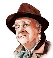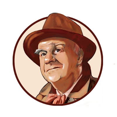

It's been about a week since my last addition to the "it's a wonderful life" poster project. I really wish I could be working more rapidly on this, but it seems I can only work on this between all the other stuff. So to explain this process, I started out with the sketch, and laid in some grey tones, then I began working on color. I tried keeping with the same color pallet as with the George and Mary painting so that when I bring them together they'll be cohesive. So I brought the painting to a completed stage and pasted it into the frame work for the poster. (That's the second image I have posted) When i saw it side by side with the George and Mary painting I saw that they didn't have the same feeling. So I had to go back to my color stage and simplify a bit and warm up the colors. Also I went for a bit more monochromatic look. I really don't want these smaller portraits to take attention away from the center of the poster which will be George and Mary, so i simplified it a bit more and the monochrome will help to tone down the level of attention that it draws. Once I got it to fit the look that I wanted, I placed it inside of a circle which will be the frame work for each of the individual portraits. I kind of liked having the tip of his cap coming out of the circle, I feel like it gives it a greater sense of volume, as though it's coming out of the framework.
I also wanted to thank everyone that has shown interest in my blog. I hope you can understand how much it helps to have the encouragement from you all. It can be pretty intimidating working on becoming an illustrator. There's a lot of really talented people that I've met over the past few years of school and when I hear people say that they like what I'm doing here on my blog it makes me feel like maybe I'm on the right track. So thank you so much with supporting me with this stuff that I love.
( Clarence "the angel" - digital painting )
( Clarence "the angel" - digital painting )


No comments:
Post a Comment